User experience mapping with strategy, flow, and journey maps help to visualize the user’s journey and define the overall design strategies.
Strategy Map and Gantt Chart
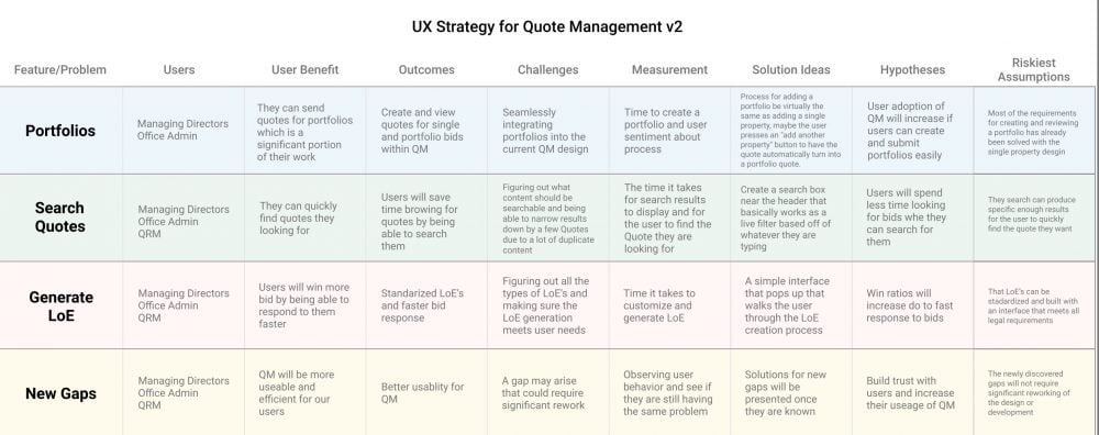
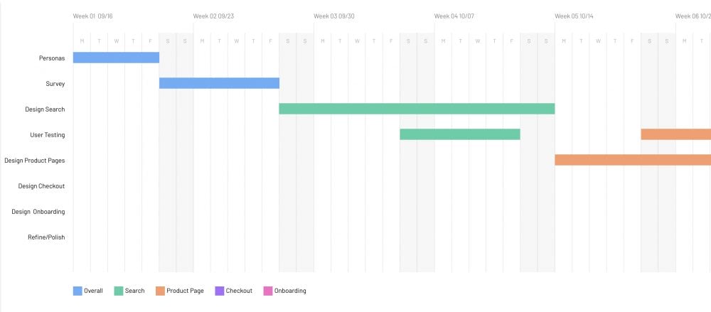
Strategy maps and Gantt charts are extremely helpful in visualizing the process design process and the timeline it will be on. This makes it easy for the team to quickly reference and stay on the same page without having to read through tons of documentation. Upper-level management, I have learned, really appreciate being able to digest your strategies in these types of visual formats.


User Experience Journey Map
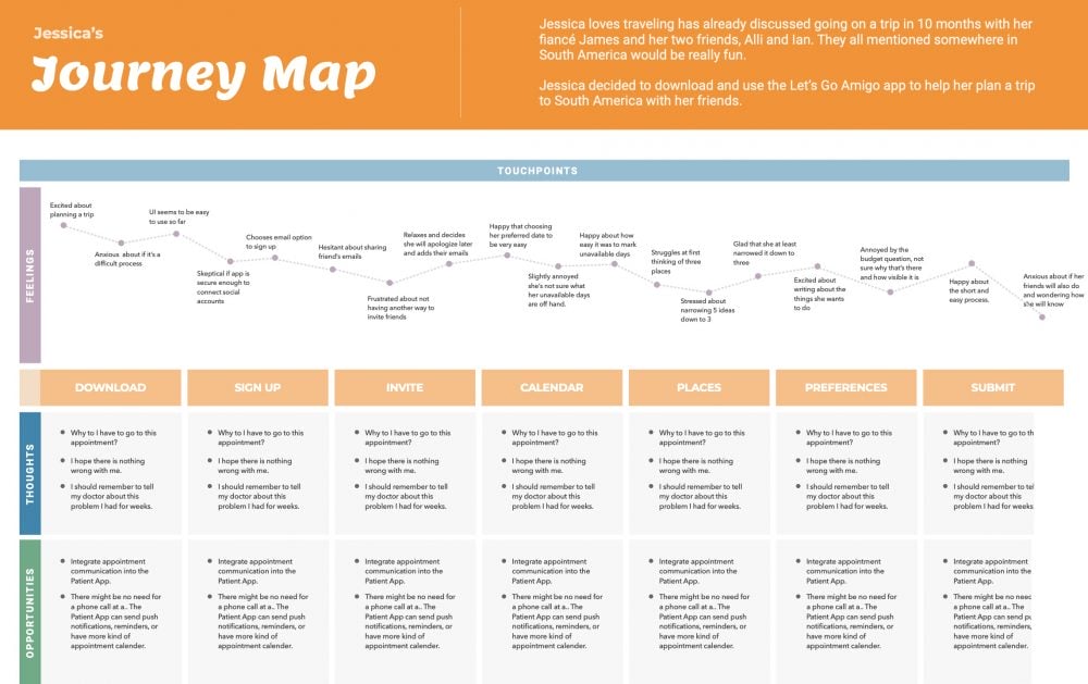
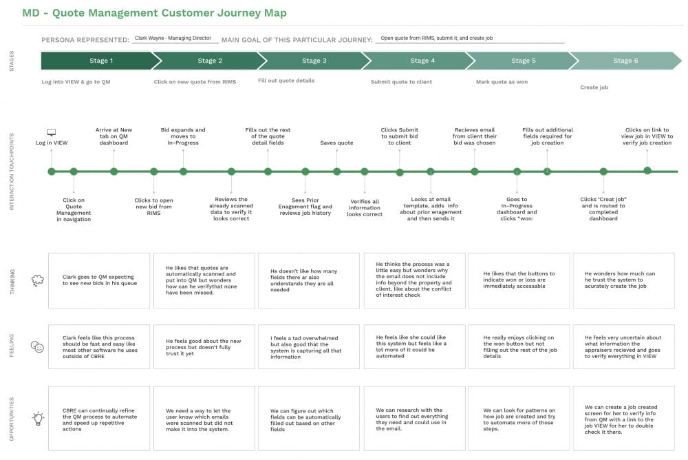
This is my favorite type of journey map. It visually illustrates all the steps involved in the process while showing which ones are painful and which ones aren’t. When I’ve used this type of journey map when presenting to company executives, they were generally very impressed with it. They like how it visually displays the data that would have taken a lot of talking and slides to explain.
Specifically, the map below, with the red and blue, has been an extremely successful map in my experiences. I have used this in a few jobs. Each time I used it my managers, directors, and execs were extremely impressed with it. It helps give them a clear visual of what the overall process is like. It also easily shows where people are having trouble and where they aren’t.


User Flow Map
These types of user flows are similar are great for user experience mapping. They show a higher-level perspective of the process and can show multiple routes the user can take.

There are many other ways to create these types of charts. Figma, my preferred design tool has a great library of templates you find here: Figma Journey Maps