This Data Visualization is of my personal income growth for my first 20 years as a working adult, from 18 to 38 years old.
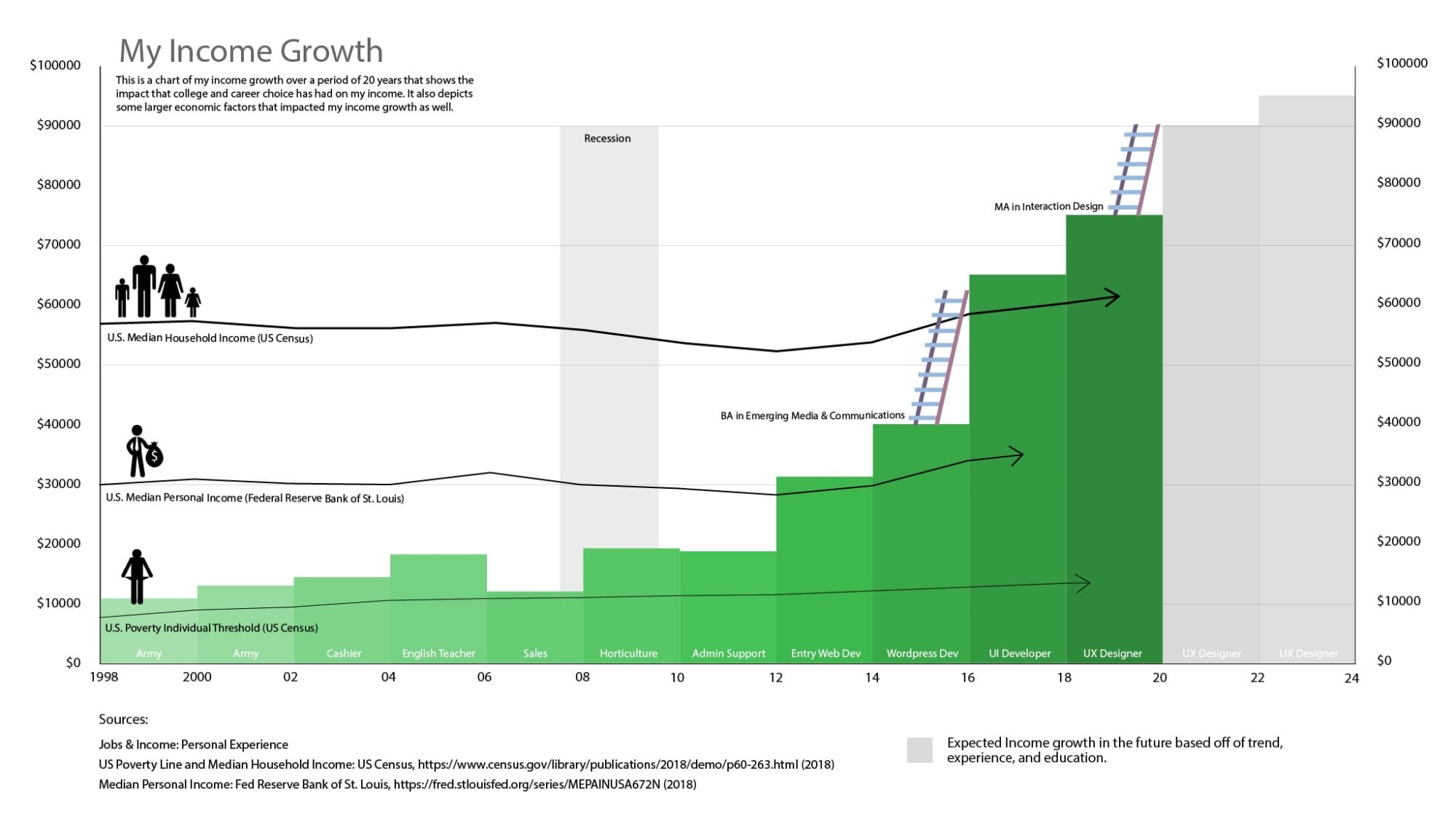
This data visualization depicts how my income has changed through my 20 years as a working adult primarily in Texas. I also added various income thresholds measured by the US government. These thresholds help put my income into perspective compared to rest of the United States.
Each bar represents two years. I didn’t change jobs exactly every two years but this roughly outlines what my job history did actually look like. To make the design coherent and easy to read to I had to simplify my work history some.
I created this chart with Adobe Illustrator.
According to Wikipedia, Data visualization, also abbreviated data viz, is an interdisciplinary field that deals with the graphic representation of data. It is a particularly efficient way of communicating when the data is numerous. Since the graphic design of the mapping of data can adversely affect the readability of a chart. Because of this, mapping is a core competency of Data visualization. Data visualization has its roots in the field of Statistics and is therefore generally considered a branch of Descriptive Statistics. People must have design, statistical, and computing skills to visualize effectively. Some people argue that it is both an art and a science.
As a UX designer, I find myself designing visuals and charts for infographics and analytic dashboards. I decided to focus on my income history as a challenge to create a visual based on data from my life.