UX/Product Designer jobs can very challenging to get hired for due to the high expectations companies have for those roles. Fortunately, I just completed my first productive week at Skyllful as UX/Product Designer, a company that hired me during the COVID-19 crisis. Four weeks ago the company I was working for notified me that they had to let me go in three weeks, along many others. COVID-19 was having huge negative impact on the company’s revenue.
Within a few days I updated my resume and portfolio and started applying for jobs. I focused on only three platforms, LinkedIn, Indeed, and ZipRecruiter. I chose them because of past positive experiences with them and the fact they seem to protect my data better. A year ago when I was looking for a job I applied for jobs on many sites. I ended up getting non stop spam calls from India for jobs in areas I don’t live in. My phone received up 10 calls and 30-50 emails a day! I had to go and delete all my profiles from every site I had joined to make the spam stop.
Tracking The Data
For this job search I started tracking every job I applied for. I logged where I first discovered the job posting and all the communications I had with the company except for generic confirmation emails.
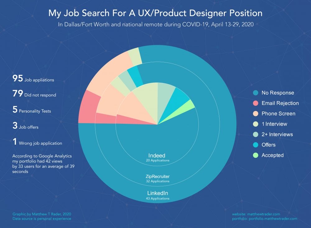
I applied for my first job on April 13th, it took only 16 days to accept a job offer. It was a very stressful and intense 16 days though. I applied for 95 jobs, did 5 personality tests and had over 20 interviews. I thought it would be interesting to make a graphic of the data I collected about my job search process.
Choosing The Right Chart
I know pie aren’t considered best way to depict comparable data, primarily because it’s hard to compare areas that are close in size. Finding the right graph was really challenging at first. I considered showing the data with multiple charts but I thought that would be hard for people to compare everything at once. I decided to show everything I could with a single chart.
The vast majority of the jobs I applied for didn’t respond at all. I felt like I was in an impossible ocean of odds and it was during one of the worse economic times in US history.
I researched different types of charts and after experimenting a bit I realized that a nested pie chart gave an interesting abstract look. The chart was able to visually display all the data I had in once chart, though not ideal. I made the “no response” color blue like a vast ocean. Once I started thinking about the ocean and the earth the infographic started taking shape. It ended up like a globe in a networked space, made mostly of water with small areas of land and even smaller livable areas with full of green life.
